|
Accounting | Business | Computer Science | General Studies | Math | Sciences | Civics Exam | Help/Support | Join/Cancel | Contact Us | Login/Log Out Elementary Statistics Homework 1 2 3 4
5-6 6.3-7
8-10 | Tests Chapter 1-3
4 5-6 6.3-7 8-10 Final Review
Elementary Statistics
(STA2023)
Homework 2 Refer to the table summarizing service times
(seconds) of dinners at a fast food restaurant.
How many individuals are included in the summary? Is it possible to identify the exact values of all of the original service times? Time (sec) Frequency 60 to 119 7 120 to 179 22 180 to 239 13 240 to 299 2 300 to 359 4 48 individuals are included in the summary. (Type a whole number.) *Explanation: Solve by adding the frequency (list). 60 to 119 7 120 to 179 22 180 to 239 13 240 to 299 2 300 to 359 4 = 48 Is it possible to identify the exact values of all of the original service times? A. Yes. The data values in each class are spread evenly across the full length of the class. B. Yes. The data values in each class are equal to the corresponding class midpoint. C. No. The frequency distribution tells nothing about the data values that fall below the lowest class limit or above the highest class limit. D. No. The data values in each class could take on any value between the class limits, inclusive.
A frequency table of grades has five classes (A,B,C,D,F,) with
frequencies of 3, 13, 15, 7 and 3 respectively. What are the relative
frequencies of the five classes?
Complete the table. Grade Frequency Relative frequency A 3 = 7.32 B 13 = 31.71 C 15 = 36.59 D 7 = 17.07 F 3 = 7.32 (Round to two decimal places as needed.) *Explanation: Add the frequency list = 41 individuals then divide each by 41 and multiply by 100. (Round to two decimal places as needed.) 3 ÷ 41 · 100 = 7.32 13 ÷ 41 · 100 = 31.71 15 ÷ 41 · 100 = 36.59 7 ÷ 41 · 100 = 17.07 3 ÷ 41 · 100 = 7.32 Identify the lower class limits, upper class limits, class width, class midpoints, and class boundaries for the given frequency distribution. Also identify the number of individuals included in the summary. Age (yr) Frequency 15 to 24 27 25 to 34 32 35 to 44 12 45 to 54 2 55 to 64 5 65 to 74 2 75 to 84 2 Identify the lower-class limits. 15, 25, 35, 45, 55, 65, 75 Identify the upper-class limits. 24, 34, 44, 54, 64, 74, 84 Identify the class width. (Type an integer or a decimal. Do not round.) 10 *Explanation: 25 – 15 = 10 Identify the class midpoints. 19.5, 29.5, 39.5, 49.5, 59.5, 69.5, 79.5 *Explanation: Upper Class + Lower Class ÷ 2 Identify the Class Boundaries 14.5, 24.5, 34.5, 44.5, 54.5, 64.5, 74.5, 84.5 *Explanation: 24 + 34 / 2 = 24.5, repeat for each set. Identify the number of individuals included in the summary. (Type an integer or a decimal. Do not round.) 82 *Explanation: *Add Frequency List     Construct a frequency distribution beginning with a lower class limit of 15.0 and use a class width of 6.0. 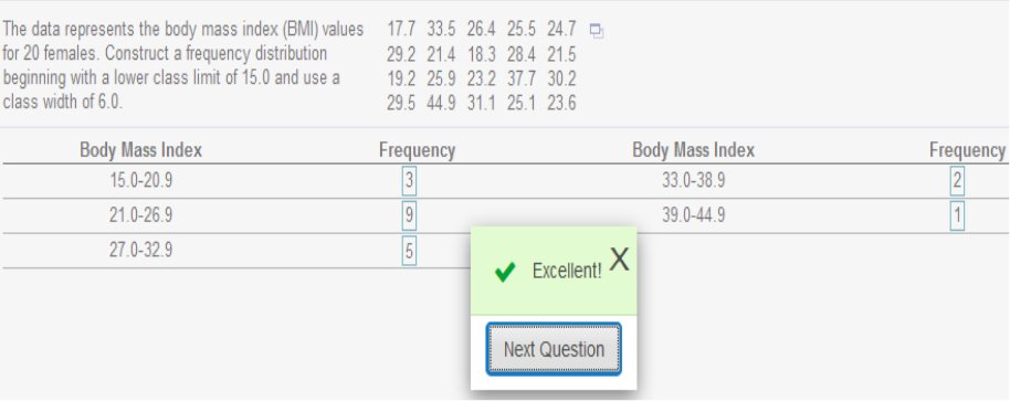 *Explanation: Arrange list in order and add each within the Body Mass Index accordingly. For example: 3 numbers in the set fall between 15.0 – 20.9. 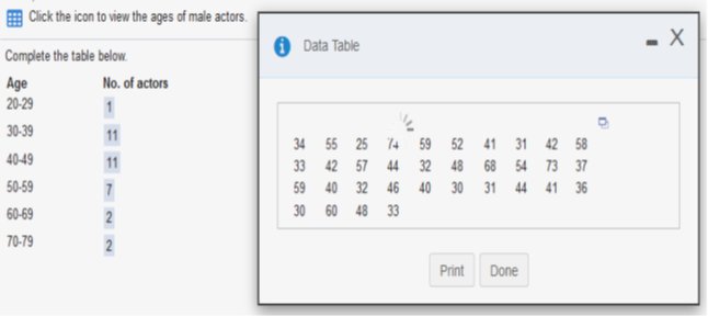 Explanation: Count the ages from the data table between 20-29, 30-39, and so on… Begin with a lower-class limit of 127.9 volts and use a class width of 0.2 volt. Does the result appear to have a normal distribution? Why or why not? 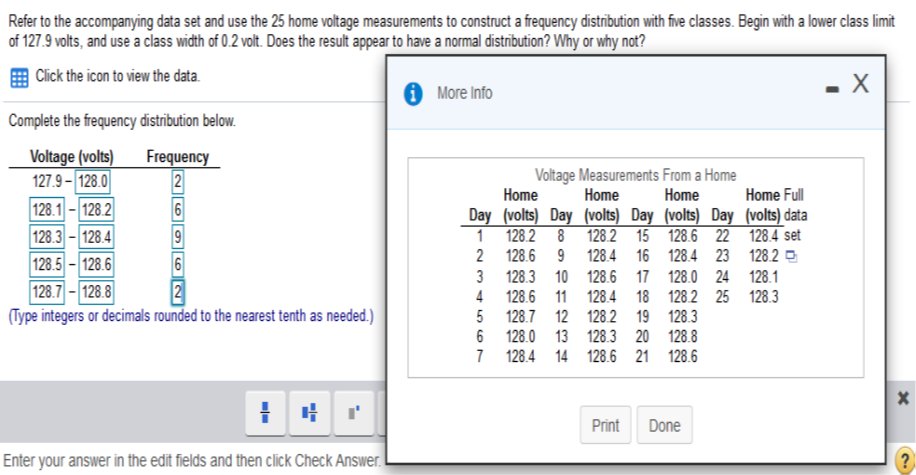 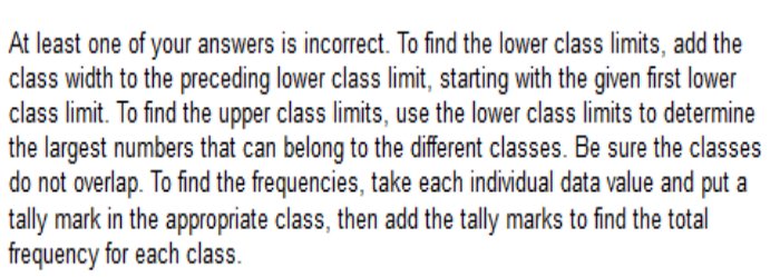  Explanation Less than 30: 20-29 = 25 Less than 40: 25 (20-29) + 35 (30-39) = 60 And so on…  Explanation Less than 40: 35-39 = 3 Less than 45: 3 (35-39) + 2 (40-44) = 5 And so on…
Among fatal plane crashes that occurred during the past 55 years
622 were due to pilot error. 69 were due to other human error. 302 were due to weather. 51 were due to mechanical problems, and 77 were due to sabotage. Construct the relative frequency distribution. What is the most serious threat to aviation safety, and can anything be done about it? Complete the relative frequency distribution below. 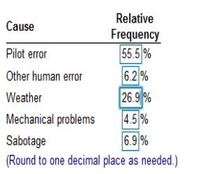  Explanation Add the total plane crashes in the past 55 years and divide by the type of error and multiply by 100. Example: (in the order of Monday through Sunday) with the frequencies 53, 65, 71, 58, 54, 44, 55. Does it appear that such births occur on the days of the week with equal frequency? 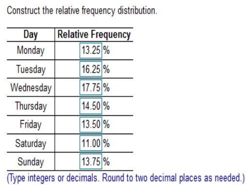 Explanation Add the total = 400 and divide by the day starting with Monday (53) then multiply by 100 (after rounding) Example: Monday - 53 ÷ 400 = .1325 · 100 = 13.25 Example: Tuesday - 65 ÷ 400 = .1625 · 100 = 16.25 And so on… Choose the correct answer below. Center Distribution Time Variation Outliers Explanation: Example: 51, 3, 6, 7, 5, 10, 54 Arrange the list in order. 3, 6, 7, 5, 10, 51, 54 We would assume 51 and 54 are outliers because they are much higher than most of the numbers in the list.
A _______ helps us understand the nature of the distribution of
a data set.
frequency distribution *Explanation: (A frequency distribution indicates the shape and nature of the distribution of a data set.)
Class width is found by _______.
Choose the correct answer below. A. subtracting a lower-class limit from the next consecutive lower class limit. B. adding the lower-class limit to the upper class limit and dividing by two. C. subtracting the smallest value in the data set from the largest value in the data set. D. subtracting the lower limit of one class from the upper limit of that same class. relative frequency
The table shows the magnitudes of the earthquakes that have
occurred in the past 10 years.
Does the histogram appear to be skewed? If so, identify the type of skewness.  The distribution of the data is Skewed to the right. Choose the correct answer below. Longer tail to the left Longer tail to the right Bell-shaped Uniform
The histogram to the right
represents the weights (in pounds) of members of a certain high-school math
team.
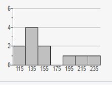 How many team members are included in the histogram? 11 *Explanation: starting from the left add the left column (at the point where the bars reach or top out) 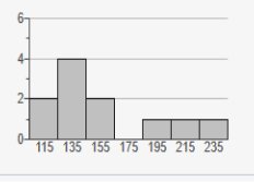 2 + 4 + 2 + 0 + 1 + 1 + 1 = 11
The histogram to the right represents the weights (in pounds)
of members of a certain high-school debate team.
What is the class width? What are the approximate lower and upper-class limits of the first class? 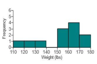 What is the class width? 10 What are the approximate lower and upper-class limits of the first class? The approximate lower-class limit is 110. The approximate upper-class limit is 120. *Explanation: Class Width = 180 – 110 ÷ 7 = 10 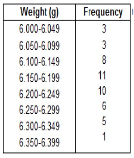 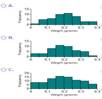 Use the frequency distribution to construct a histogram. Does the histogram appear to depict data that have a normal distribution? Why or why not? B 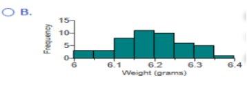 A. The histogram appears to depict a normal distribution. The frequencies generally decrease to a minimum and then increase. B. The histogram does not appear to depict a normal distribution. The frequencies generally increase and the histogram is roughly symmetric. C. The histogram does not appear to depict a normal distribution. The frequencies generally decrease to a minimum and then increase, and the histogram is roughly symmetric. D. The histogram appears to depict a normal distribution. The frequencies generally increase to a maximum and then decrease, and the histogram is roughly symmetric. 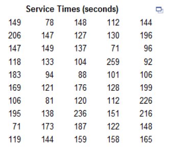 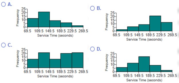 Answer is “A” 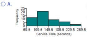 The histogram has a longer right tail, so the distribution of the data is skewed to the right. *Explanation: Count the service times (69.5 – 109.5 – 149.4 – 189.5 – 229.5 – 269.5) and match them to the appropriate graph. Frequency Explanation A histogram is a graph consisting of bars of equal width drawn adjacent to each other (without gaps). The horizontal scale represents classes of quantitative data values, and the vertical scale represents frequencies. The heights of the bars correspond to the frequency values. Touch Explanation A histogram is a graph consisting of bars of equal width drawn adjacent to each other (without gaps). Therefore, the bars touch. shape of the distribution Explanation A histogram is a visual tool used to represent and analyze data. It is basically a graphic version of a frequency distribution, and it can show the center, variation, and the shape of the distribution of the data. Relative frequency *Explanation: A histogram is a graph consisting of bars of equal width drawn adjacent to each other (without gaps). A relative frequency histogram has the same shape and horizontal scale as a histogram, but the vertical scale is marked with relative frequencies (as percentages or proportions) instead of actual frequencies. Normal *Explanation: When graphed, a normal distribution has a "bell" shape. Characteristics of the bell shape are (1) the frequencies increase to a maximum, and then decrease, and (2) symmetry, with the left half of the graph roughly a mirror image of the right half.
Homework 2.3
Construct a stem-and-leaf plot of the test scores 67, 72, 85, 75, 89, 89, 87, 90, 99, 100. How does the stem-and-leaf plot show the distribution of these data? Construct the stem-and-leaf plot. Choose the correct answer below. Useful Tool https://www.calculatorsoup.com/calculators/statistics/stemleaf.php  stem-and-leaf plot calculator https://www.calculatorsoup.com/calculators/statistics/stemleaf.php Basic Statistics: Minimum: 67 Maximum: 100 Count: 10 Sum: 853 Mean: 85.3 Median: 88 Mode: 89 Standard Deviation: 10.92 Variance: 119.3 Graphs We use graphs to analyze data. Scatterplot *Explanation: A scatterplot (or scatter diagram) is a plot of paired (x,y) quantitative data with a horizontal x-axis and a vertical y-axis. The horizontal axis is used for the first (x) variable, and the vertical axis is used for the second variable. The pattern of the plotted points is often helpful in determining whether there is a relationship between the two variables. a nonzero axis. *Explanation: Using an axis that does not begin at zero can create an incorrect impression that small differences are substantial. Choose the correct Pareto chart below. Try and follow the correct answer according to the Frequency (list)  Among such retractions, does misconduct (fraud, duplication, plagiarism) appear to be a major factor? A. Yes, misconduct appears to be a major factor because the majority of retractions were due to misconduct. B. No, misconduct does not appear to be a major factor because the majority of retractions were not due to misconduct. C. No, misconduct does not appear to be a major factor because the majority of retractions were due to misconduct. D. Yes, misconduct appears to be a major factor because the majority of retractions were not due to misconduct. 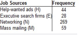 Try and follow the correct answer according to the Frequency (list) 250 is the Blue Bar, 59 is the Red Bar, and so on.  If someone would like to get a job, what seems to be the most effective approach? 
The graph to the right compares teaching
salaries of women and men at private colleges and universities. What
impression does the graph create? Does
the graph depict the data fairly? If not,
construct a graph that depicts the data fairly.
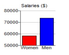 What impression does the graph create? A. The graph creates the impression that men have salaries that are more than twice the salaries of women. B. The graph creates the impression that men have salaries that are slightly higher than that of women. C. The graph creates the impression that men and women have approximately the same salaries. D. The graph creates the impression that women have salaries that are slightly higher than that of men. Does the graph depict the data fairly? A. No, because the vertical scale does not start at zero. B. No, because the data are two-dimensional measurements. C. Yes, because the bars accurately represent each average. D. Yes, because the vertical scale is appropriate for the data If the graph does not depict the data fairly, which graph below does?  Does the graph distort the data, or does it depict the data fairly? Why or why not? If the graph distorts the data, construct a graph that depicts the data fairly. 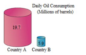 A. Yes, because the graph incorrectly uses objects of volume to represent the data. B No, because the proportions are accurate. C. No, because the graph is technically correct. D. Yes, because 3D objects always distort the data in graphs. If the graph does not depict the data fairly, which graph below does?  |
| Home |
Accounting & Finance | Business |
Computer Science | General Studies | Math | Sciences |
Civics Exam |
Everything
Else |
Help & Support |
Join/Cancel |
Contact Us |
Login / Log Out |